Building trust through transparent design in a complex financial platform
Overview
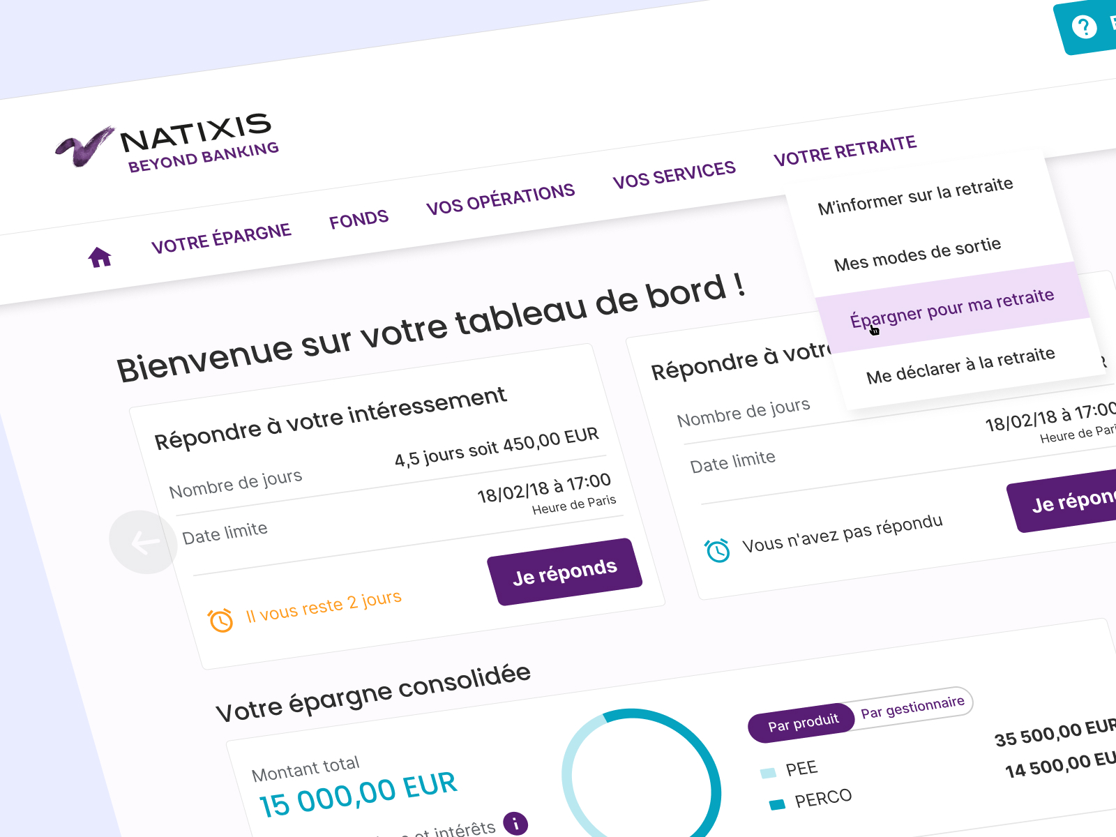
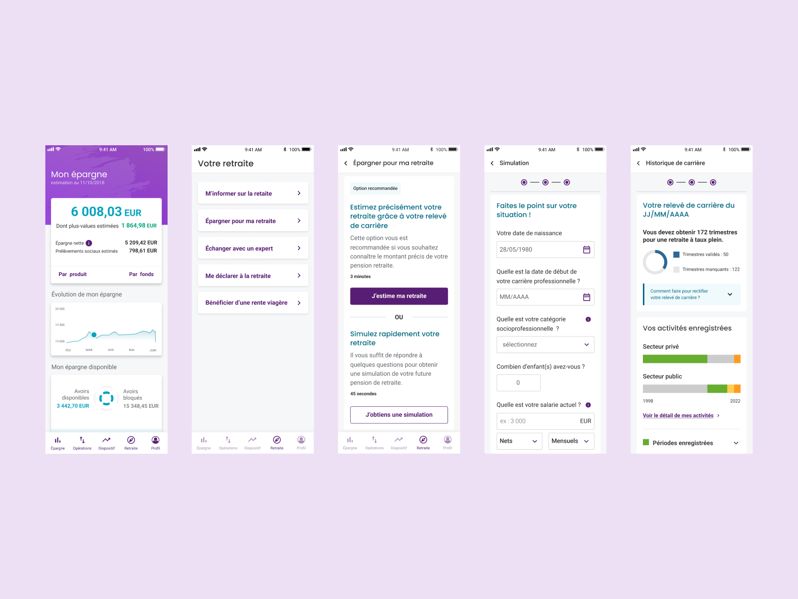
Natixis Interépargne is a French financial services platform for retirement savings. Users had to bounce between 2 separate websites (consumer side + business side) with completely different UIs. I was embedded Product Designer as consultant, 2 years (Jan 2022 – Dec 2023).
Challenge
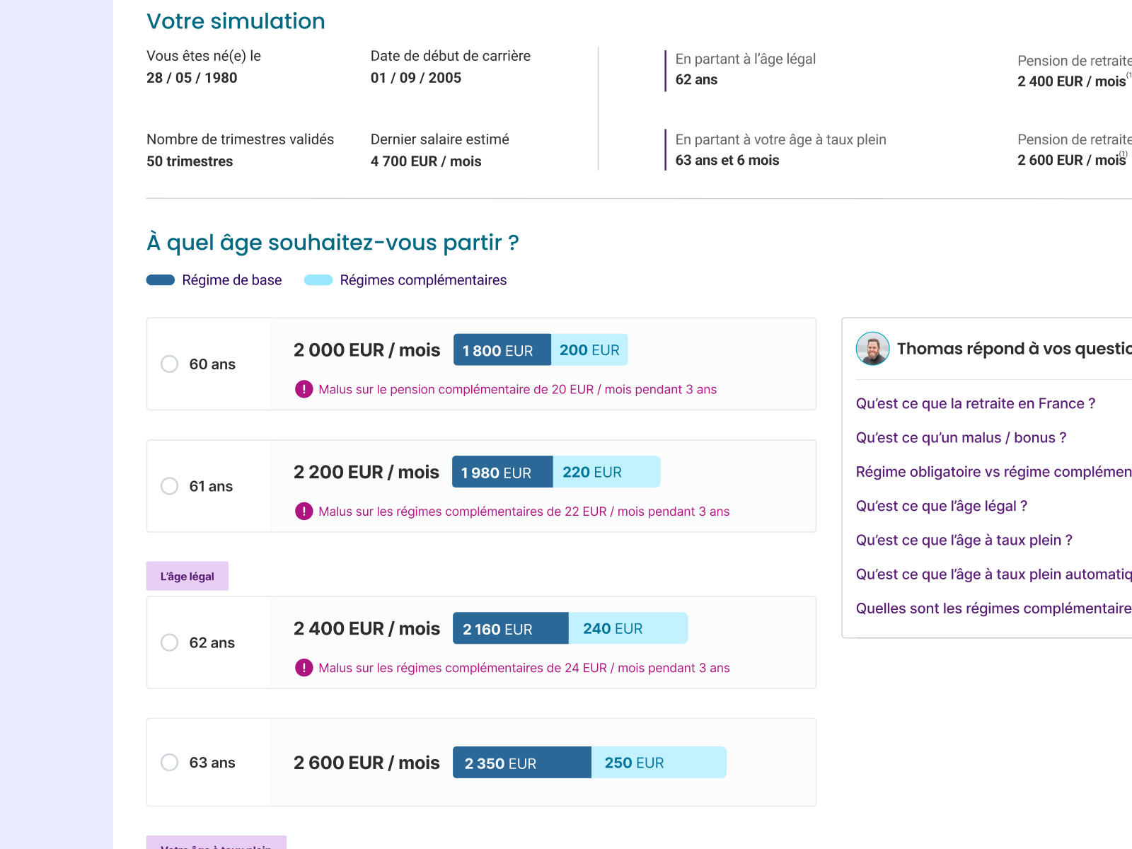
Users trying to simulate retirement savings were lost — inconsistent navigation, conflicting information, high drop-off before reaching savings products. But the real constraint: RGAA compliance (French accessibility standard, stricter than WCAG 2.1). Can't just redesign; must meet legal requirements.
Objective: −25% drop-off rate + 100% RGAA compliance + migrate 200+ components from legacy tools (Sketch/InVision) to a scalable system (Figma).
Approach
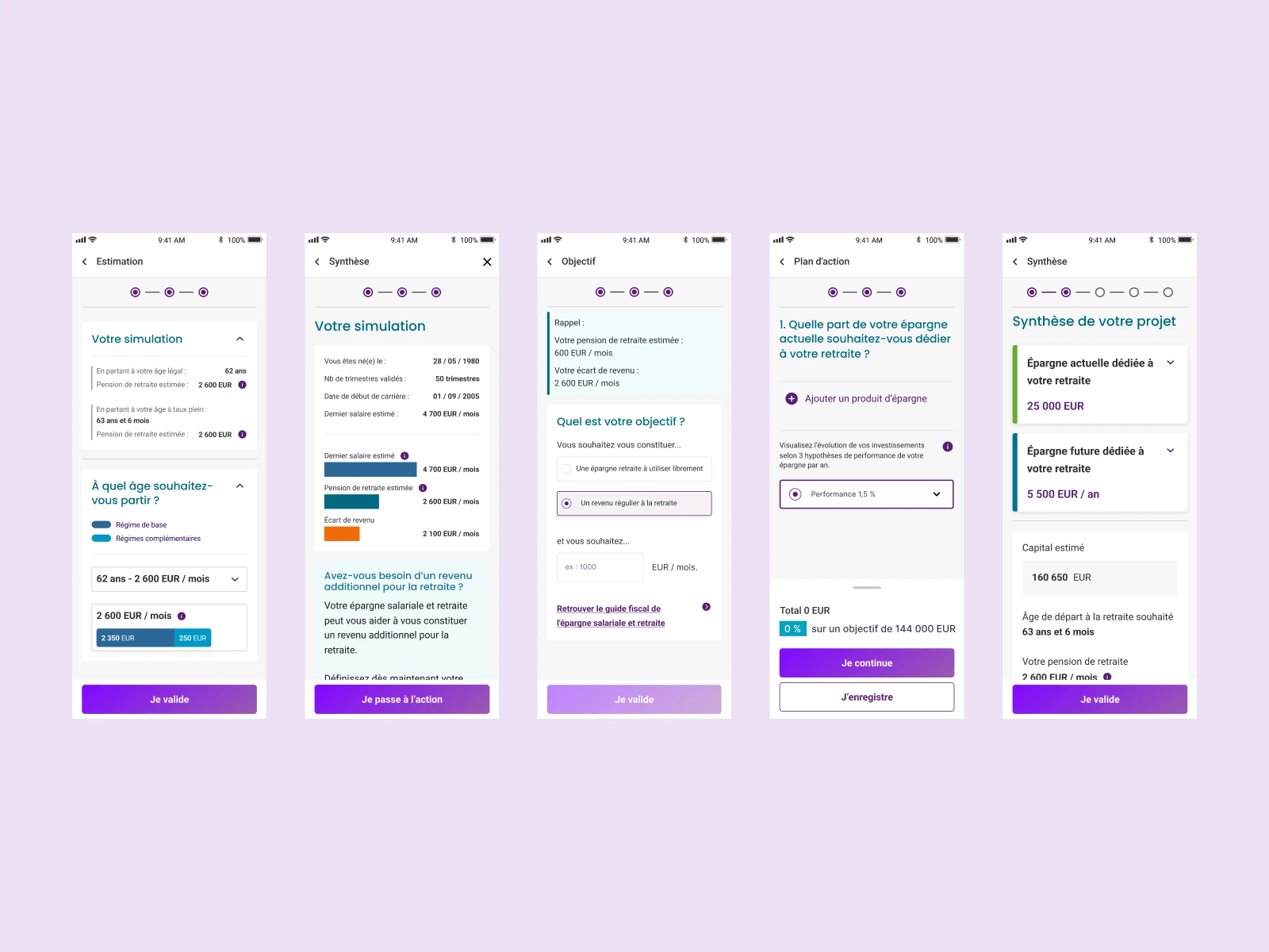
Unified two broken websites — Users bounced between conflicting UIs. Decision: one cohesive journey instead of separate silos.
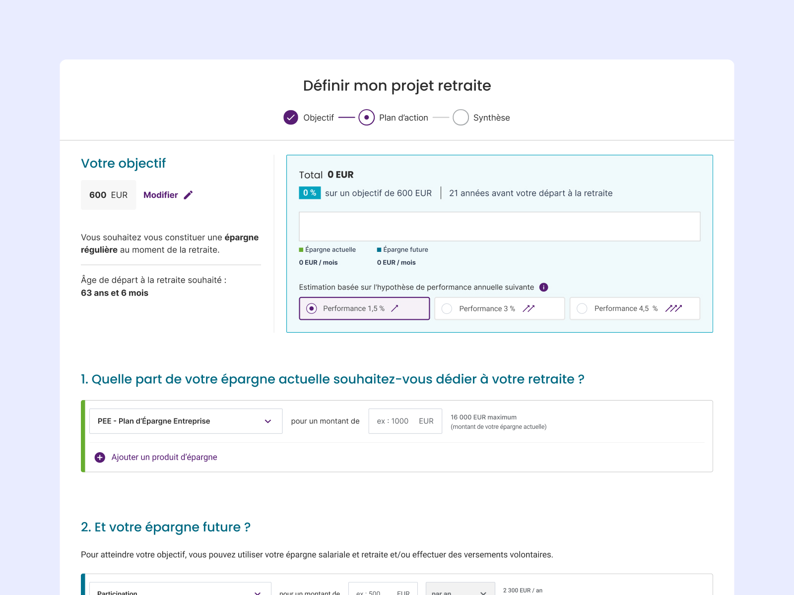
Made accessibility the constraint — RGAA compliance from day 1, not last. Result: better design for everyone.
Made the calculator transparent — Users didn't trust black box math. Showed assumptions, step-by-step calculation. Trust went from 15% → 50%.
Migrated smartly — Audited 200 components, consolidated to 120 true components by removing redundancies.
Built governance — System docs explained "why," not just "what." Prevented regression.
Results
29% drop-off rate on retirement simulation path
200+ components migrated and consolidated
100% RGAA compliance certification (legal requirement met)
Design system ready for next 2 years of product work
What I learned: Enterprise design isn't sexy, but constraints breed creativity. RGAA isn't a limitation — it's a forcing function. When you design for accessibility first, you design better for everyone. And the hardest part wasn't the UI. It was convincing leadership that consolidating two websites was better than maintaining separate silos.